View All


1. Interest rates by country
We plotted 20 years of global interest rate data from the Reserve Bank of Australia in one chart:
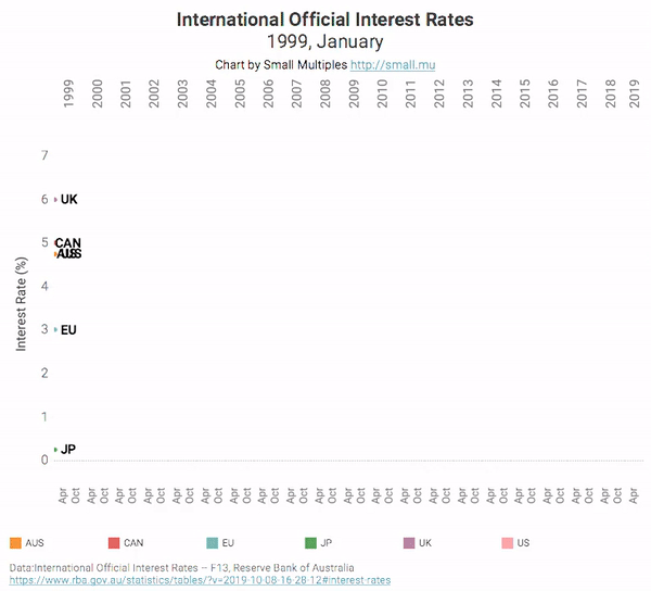
Central banks generally drop interest rates in order to stimulate the economy (you can see a big dip in rates following the 2008 financial crisis, for example). This works by encouraging borrowing and spending. On the other hand if central banks feel like the economy is overheated (there’s too much borrowing and spending, risking overinflation and a bubble), they can increase the interest rates to dampen the market.
If the current Australian rate is anything to go by, the RBA is trying very hard to stimulate the economy, increase consumer spending and avoid recession. We’re currently at an all time record low of 0.75%. As rates approach zero though, this stimulus tool stops being useful and the RBA will have to consider other measures.
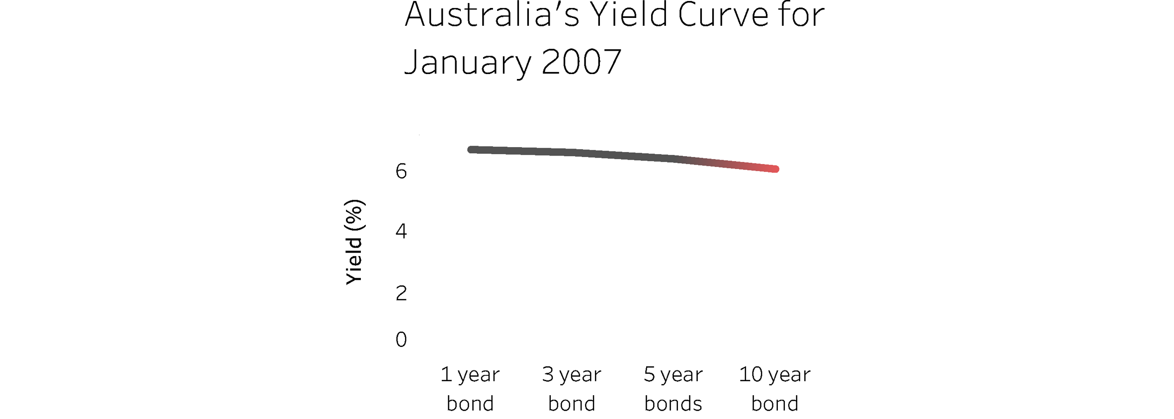
2. The famous yield curve
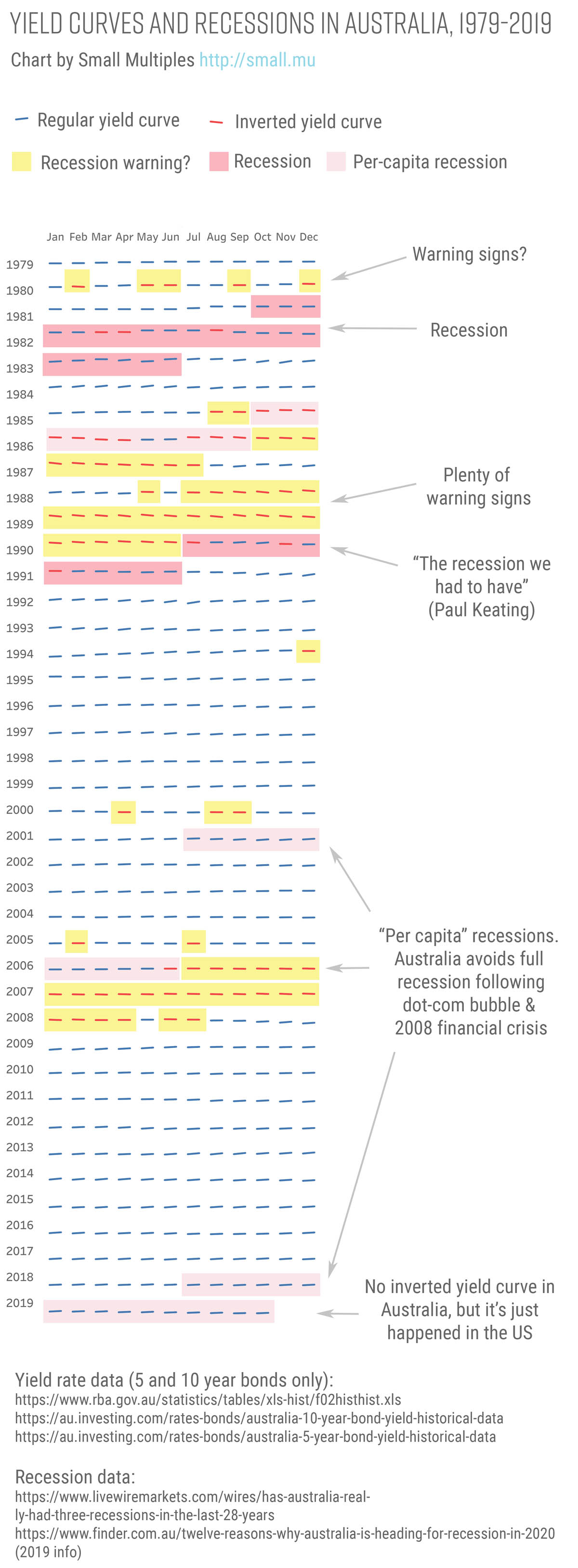
This little curve has been getting a lot of attention recently. The “yield curve”, as it’s known, is one of the most reliable predictors of recession that we have.
So what is the yield curve? Basically, it reflects the rates of return on government bonds. If you buy a 10 year bond, you would expect it to have better returns (a better interest rate to cost ratio) than a 5 year bond, which would have higher returns than a two year bond - an upward curve.

Government bonds are bought and sold in the private (secondary) market though, so the price reflects supply and demand. If investors think that a downturn is coming soon, the price of short term bonds (for example 2 year bonds) will fall - people don’t want to get their money back in a bad economy, when there’s nothing promising to invest in. But because the price is dropping, the return relative to the price increases. On the other hand, 10 year bonds may become more popular - people want their returns once the economic downturn is over, and there’s good investments to be made. But because of this popularity, the price of these bonds increases - hence the relative return drops. The inverted yield curve.
(If you’re still confused, here’s a great video by Vox)
We recreated the chart with Australian data, to see what patterns we could make out. As you can see, it’s predicted all Australia’s recent recessions to some extent, but the latest per-capita recession is a bit of an exception.
So what’s a per-capita recession? You might be surprised how slippery the definition of a recession actually is. Different algorithms take into account not just GDP, but unemployment and many other factors. The source of recession data for this chart uses the most common definition, being “two or more consecutive quarters of falling real GDP”. It also discusses ‘per-capita’ recessions though - where the GDP per-capita falls for two consecutive quarters. In other words, when GDP growth is not keeping up with population growth.
Interestingly, although we’re technically already in per-capita recession, the Australian yield curve hasn’t inverted yet (though it’s flattening). It has just inverted in the U.S. and Canada though.
3. Home loans and credit card loans by the big 4 banks
.gif)
Debt is a double-edged sword. On the one hand, if people are borrowing and spending, that stimulates the economy. On the other hand if debt gets out of control, then people have to rein in their spending and focus on repayments - creating the opposite effect. Short term gains can mean long term pain.
We charted both home loans and credit card loans on the same chart over time. It seems to show that people have been borrowing a lot in recent years, but are now starting to rein things in. What do you think?
Tired of looking at spreadsheets? Let us visualise your data. Get in contact.